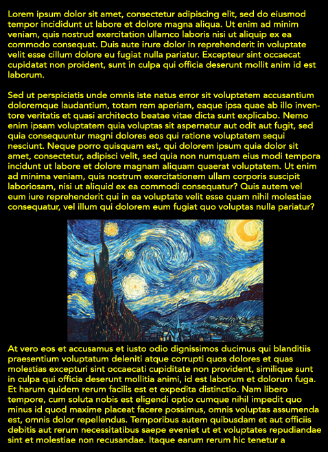
It is NOT recommended to use a dark background on a newsletter.
From this Constant Contact article:
11 Mistakes That Make Your Email Newsletter Absolutely Unreadable
Putting light text over a dark background can strain a person's eyes until he or she gives up reading the email completely.

Also, in some email clients, the default font color can be white, in which case your white text will be invisible!
Bottom line:
While it may look great on your art website, dark backgrounds are not a good idea for email newsletters that will be viewed in different email programs.
01302018