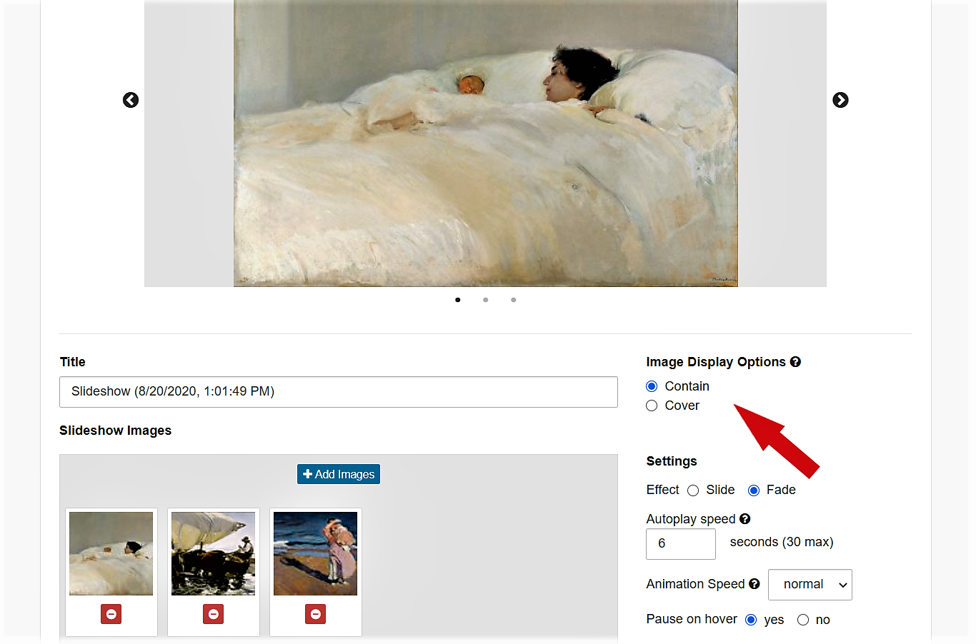
When you use a home/main page slideshow that includes horizontal and vertical images, plus it's set to the Contain setting, the software makes room for the various shapes/ratio.
It's not obvious on a large monitor like desktop, but on mobile - especially viewing vertically on a cell phone with it's skinny format - it can cause extra blank space above and below the horizontal images. The more panoramic they are, the more extra space.
Examples from Mobile
Like these:


Now, some designers find negative space to be soothing and a good thing. Not a fan?
Options
There are 3 solutions:
a) Choose images with similar format for your slideshow - all vertical for example.
b) Choose the Cover option for your slideshow (instead of Contain) - this crops images that don't fit. This style gives your site visitors a feel for your work but leaves them wanting more.

c) Use a single main/home page image in lieu of the slideshow.
08202020 jyc